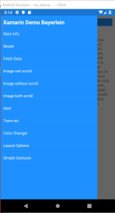
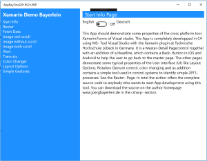
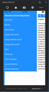
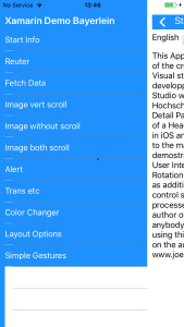
Here you can find my own first Demo App. It works with a C# – Master Detail page control and carries several pages, which I use in my lecture to demonstrate functions and possibilities and how to work with xamarin forms. Here are screenshots (from left to right) of the master page on an Android emulator, UWP-App on my local machine, iphone emulator on my Win10 machine and a real iOS phone 6 screenshot (This work only latest Nov 2019, Apple has stopped support of Iphone6) You absolutely need iOS 13.2 or higher on your iPhone or iPad device.:
You can get the source of the pages here, start with a blank cross platform project to avoid compatibility problems. It is really impossible to transfer complete projects with all folders and files to another PC, because it is in total larger than 200MBytes. So the way to start a given project is always the best to start an empty blank cross platform project and fill the projects manually with the given files and make some adaptions. To learn something about the steps start first with the gallery- project described on my introduction page. Here you can find a Nov 2019 actualized document.
Do the following steps:
- Unzip the page file AppBayFinal2019-ohne-bin-obj
- Start the sln- file and try starting one or all platform projects.
- If error messages occur go with steps described in the Nov 2019 actualized document
Some information to the main project:
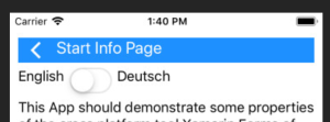
The master page is „Page1“. There you can define the central Background Color „ColorBack“ of Master Page and all page head lines, as default you see it is „DodgerBlue“. The text color is defined in „ColorText“ and is default White. Note that with background color change to white you can not see any text nor the Back-Button. To make it more convenient each detail-page in Android and iOS contains a „back-Button“ defined with a „BackIcon“, which is at this time for Android a white arrow and for iOS same arrow without line on transparent background. Change it if you like other symbols. See next pictures of the head line of the Android „Start Info Page“: UWP doesn’t need this back button, because no Win Phone exist anymore and the UWP – screens are large enouph to display master and detail page at the same time. And iOS has an arrow without line, see screenshots (left Android, right iOS). Additionally the iOS needs a top padding, which is larger than the other systems.
Android iOS
Some information to the single pages
General
Any detail page has a standard building block. First there is an Image view containing the „Back-Button“. The TapGestureRecognizer of this image reopens the master page. Second together with the LabTitle a horizonataly oriented Stacklayout „top“ defines the header of each page. Depending on platform the BackButton – Image is loaded with Android or iOS back symbol.
Start info
This page is the default starting page and gives information to the user. A switch can change the text into German text.
Reuter
This page is an example to demostrate calculating possibilty. I use this method in my control system lab to identify a dynamical second order lowpass system which is necessary to define a PIDT1- controller. After measurement of the step response of the system by manually drawing the inflection tangent and with this tangent defining the both times Tu and Tg this Reuter page calculates the both Time constants of the 2 PT1 and sometimes an additional delay time. Here you can see the inputs and outputs of flowting point numbers and the compatibility of the C# -code. This algorithm is a 1:1 copy out of my tool written in Windos Forms. Additionally I use a special converting method for the floating point values. This makes it independent of the decimal separator, which can be a dot (.) or a comma (,) .
Fetch data
This is a simple page demonstrating the data exchange from detail page1 to detail page1. The button click reads the content of the entry field of the Reuter- page and writes it into a Label. The method works simply with a back reference in Pointer „MeinMain“ to the master page delivered in the argument of the constructor.
Image vert scroll
The next three pages demonstrates the complicated combinations of main properties of an image view. Here user can learn which property is necessary to display a picture exactly in that manner he wants to do it. This depends not only on the properties, but also on the container. So here a vertical ScrollView is used for the image. The display of a picture (size / proportion / position etc.) first depends on the horizontal and vertical layout options. Each layout option has 8 different values, which can be selected with picker. This are 64 different possibilities. Additional a view has three different Aspect- properties gives together 192 combinations. Then you can select with the two sliders two further properties WidthRequest and HeightRequest. The real final Width and Height of the picture depends on all thousends of possible combinations. Play with it and learn the way to use them.
Image without scroll
Same as before, but the image is not embedded into a ScrollView, only in a fixed ContentPage.
Image both scroll
Same as before, but image now is embedded into a ScrollView with scroll orientation „Both“.
Alert
Demostrates the display and response of a typical Alert box in all platforms
Trans etc
Here the properties TranslationX, TranslationY, Scale, Rotation, RotationX, RotationY, Anchorx and AnchorY can be selected with a picker and changed with a slider. With a picture you can see results and combinations of properties.
ColorChanger
In this page the color of a boxview can be changed with either the three sliders R(Red), G (Green) and B (Blue) or after a click on the button „Change HSL-Values“ the color can be changed with the values „Hue“ (Color- value), Saruration and Luminosity, sometimes also called Brightness. Any HSL- value is then converted into the RGB- values or any RGB-value is converted after a click on the „Change RGB values“ into the HSL- Values. Here you can get familiar with the different methods to define a color.
Layout options
Here simply the layout options of three labels and a picker are demonstrated. Similar but more simple than the three image pages above. The picker for vertical options and the three labels (background color black to see the real size) are embedded in a simple StackLayout.
Simple Gestures
Here the programming and the function of the three possible GestureRecognizers Tap, Pan and Pinch are demonstrated. If you tap on the picture, a label shows the reaction „is tapped“. If you panning, meaning moving the finger after tapping the picture will follow the movement. If touch screen supports multifingering, the pinch is a two- finger touch with which you can change the size of the picture. This works on UWP very well, is not supported in our Raspberry system and has some at this time strange effects on Android and iOS. The code to change the image size has to be optimized in the future.
